Italic Calligraphy Foundations — The Renaissance Humanist Hand
안내
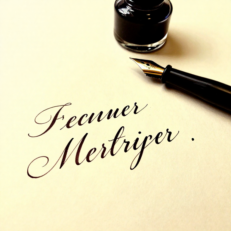
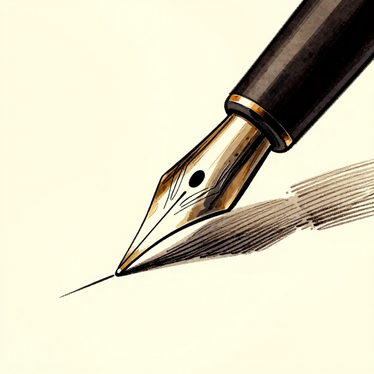
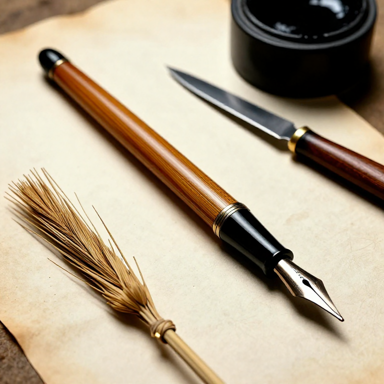
Prepare the Nib and Load Ink
Prepare the Nib and Load Ink
Insert the broad-edge nib into the pen holder. New nibs have a thin coating of machine oil to prevent rust during shipping — remove this by passing the nib briefly through a flame (1-2 seconds) or wiping with rubbing alcohol, then drying. This allows ink to flow onto the metal surface. Dip the nib into the ink bottle so that ink covers the nib up to the breather hole (the small hole or slit in the nib body). The breather hole regulates air flow and ink delivery. Touch the nib to the edge of the bottle to remove excess ink. Too much ink causes blobs; too little causes skipping.
이 단계의 재료:
 India Ink30 ml
필요한 도구:
 Calligraphy Pen Set
 Paper Towel
 Container
Draw Guidelines on Practice Paper
Draw Guidelines on Practice Paper
Using a pencil and ruler, draw horizontal guidelines on your practice paper. For a 2mm nib, the x-height (height of lowercase letters like a, e, o) should be 5 nib-widths — turn the nib sideways and make 5 stacked squares to measure this (approximately 10mm). Mark a baseline and a waist line 5 nib-widths above it. Add an ascender line 4 nib-widths above the waist line and a descender line 4 nib-widths below the baseline. Draw a slant line at 5-10 degrees from vertical — italic letters lean slightly forward. Space guideline sets about 15mm apart for comfortable writing.
이 단계의 재료:
 Calligraphy Practice Paper20 장
필요한 도구:
 Graphite Pencil Set
 Protractor
Establish the 45-Degree Pen Angle
Establish the 45-Degree Pen Angle
Hold the pen so that the flat edge of the nib meets the paper at a 45-degree angle to the baseline. This angle is maintained throughout all strokes — the pen does NOT rotate in your hand during writing. At 45 degrees, a horizontal stroke produces a thin line and a vertical stroke produces a medium-width line. A diagonal stroke from upper-left to lower-right produces the thickest possible line (full nib width), while upper-right to lower-left produces the thinnest hairline. This automatic thick-thin variation is what gives calligraphy its character — the pen angle does the work, not finger pressure.
필요한 도구:
Calligraphy Pen SetPractice Basic Downstrokes and Entry Serifs
Practice Basic Downstrokes and Entry Serifs
Begin with the simplest stroke: a straight downstroke from waist line to baseline. Place the nib at the waist line, pause briefly to form a clean starting edge, then pull straight down to the baseline. The stroke should be even in width with clean edges. Next, add an entry serif: start with the nib at 45 degrees, make a tiny thin upstroke (about 1 nib-width), then curve smoothly into the downstroke without lifting the pen. This entry serif is the characteristic hook at the top of letters like i, l, t, and the first stroke of n, m, h. Practice rows of these until the serif flows naturally into the downstroke.
필요한 도구:
Calligraphy Pen SetPractice the Branching Arch
Practice the Branching Arch
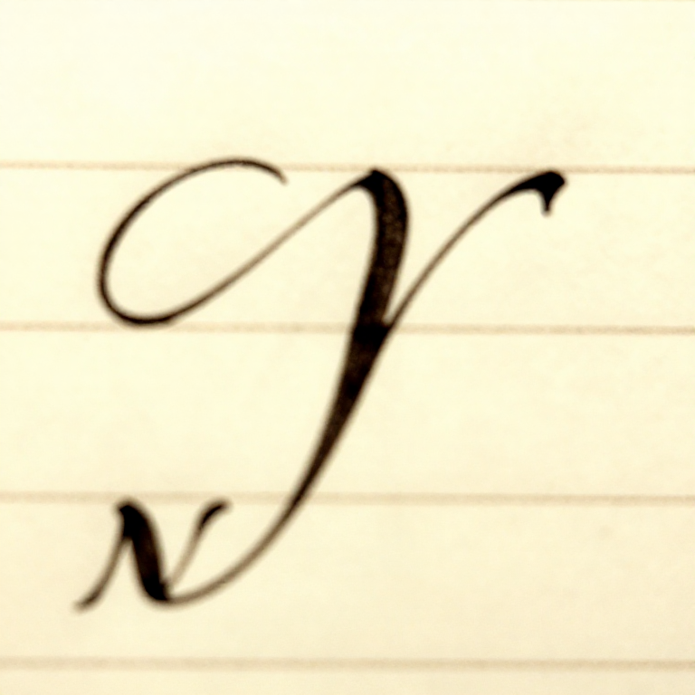
The branching arch is the defining stroke of italic calligraphy. It forms the curve in letters like n, m, h, b, p. Starting from a downstroke, the arch branches out from approximately two-thirds of the way up the stroke height — NOT from the top and NOT from the bottom. Push the pen upward and to the right, curving over into a second downstroke. The key is that the branch leaves the first stroke with a thin connection (because the movement is nearly horizontal at 45-degree pen angle) and thickens as it curves over and descends. The arch should be symmetrical: the space inside the arch should mirror the space between the two vertical strokes. Practice the letter n repeatedly — it contains one branching arch and embodies the proportions of the entire alphabet.
필요한 도구:
Calligraphy Pen SetBuild the Letters i, l, t — Simple Vertical Forms
Build the Letters i, l, t — Simple Vertical Forms
The letter i is a single downstroke with entry serif and exit serif (a small flick to the right at the baseline), plus a dot placed at the ascender line directly above the stroke. The letter l extends from the ascender line to the baseline — same stroke as i but taller. The letter t rises only 1-2 nib-widths above the waist line (not to the full ascender height) and has a horizontal cross-stroke at the waist line. These three letters establish your fundamental stroke rhythm and spacing. The white space between repeated letters should be approximately equal to the space inside the letters.
필요한 도구:
Calligraphy Pen SetBuild the Letters n, m, h — Branching Arch Family
Build the Letters n, m, h — Branching Arch Family
The letter n consists of one downstroke plus one branching arch curving into a second downstroke with an exit serif. The letter m adds a second arch: downstroke, arch, downstroke, arch, downstroke. The arches in m must be identical in shape and spacing — this is one of the hardest letters to make consistent. The letter h is an ascender stroke (starting at the ascender line) with a branching arch that starts at the waist line level. The arch shape in h, n, and m must be identical. Once you can write these three letters consistently, you have mastered the core structural element of italic calligraphy.
필요한 도구:
Calligraphy Pen SetBuild the Round Letters o, c, e
Build the Round Letters o, c, e
The letter o is constructed in two strokes: a counter-clockwise curve from approximately 1 o'clock position down and around to approximately 5 o'clock, then a second stroke from 1 o'clock down clockwise to meet the first stroke at 5 o'clock. The o should be slightly oval (taller than wide) in italic. The thinnest points are at the top and bottom (where the pen moves horizontally); the thickest points are at the sides (where the pen moves vertically). The letter c is the left half of the o — the counter-clockwise stroke only, ending with a small serif. The letter e adds a horizontal stroke at the midpoint of the c shape, creating the crossbar.
필요한 도구:
Calligraphy Pen SetBuild Letters with Ascenders — b, d, k
Build Letters with Ascenders — b, d, k
Ascenders rise from the waist line to the ascender line. The letter b starts with a full ascender downstroke, then adds a clockwise bowl at the baseline (like the right half of o, attached to the base of the stroke). The letter d begins with the counter-clockwise bowl of o, then adds an ascender downstroke on the right side. Note that d is NOT a mirror of b — in italic, d's ascender is a separate downstroke that starts at the ascender line, while b's bowl grows from the base of its ascender. The letter k has an ascender downstroke, then two diagonal strokes meeting at the midpoint: an upper diagonal coming in from the right and a lower diagonal kicking out to the right.
필요한 도구:
Calligraphy Pen SetBuild Letters with Descenders — g, p, q, y, j
Build Letters with Descenders — g, p, q, y, j
Descenders drop below the baseline by 4 nib-widths. The letter g starts with an o-shape, then adds a descender stroke dropping from the right side, curving left at the bottom (the tail). The letter p has a downstroke descending below the baseline, plus a clockwise bowl (like b) at the waist-to-baseline zone. The letter q mirrors p: counter-clockwise bowl with a descender on the right side. The letter y combines a left-leaning diagonal with a right-leaning diagonal descender. The letter j is an i with the downstroke extended below the baseline into a leftward curve. Descenders should never collide with the ascenders of the line below — this determines your line spacing.
필요한 도구:
Calligraphy Pen SetBuild the Remaining Lowercase Letters
Build the Remaining Lowercase Letters
Complete the alphabet: a is a c-shape with a downstroke on the right side. The letters f and long-s are ascender-height strokes with a crossbar at the waist line (f curves right at top, extends below baseline). The letter r branches like n but the arch stops short — a small shoulder stroke curving right without descending into a full second downstroke. The letter s is constructed in two curves: a clockwise curve at the top flowing into a counter-clockwise curve at the bottom (the hardest letter in italic because the pen angle fights the natural curve direction). The letters u, v, w are inverted arch forms; x is two crossing diagonals; z is three strokes — a horizontal, a diagonal, and a horizontal.
필요한 도구:
Calligraphy Pen SetPractice Letter Spacing and Word Formation
Practice Letter Spacing and Word Formation
Correct letter spacing is as important as correct letter forms. The fundamental rule: the area of white space between any two adjacent letters should appear visually equal throughout a word. Two vertical strokes (like n-n) need the most physical space between them. A vertical next to a round letter (n-o) needs slightly less space because the curve already opens up white area. Two round letters (o-o) need the least physical space. Practice the word 'minimum' — it contains only vertical strokes and arches, making spacing errors immediately visible. Then practice words mixing round and straight letters: 'handwriting', 'calligraphy', 'foundation'. Read your practice words from arm's length — spacing problems become obvious at a distance.
이 단계의 재료:
Calligraphy Practice Paper20 장필요한 도구:
Calligraphy Pen SetAdd Italic Flourishes and Ligatures
Add Italic Flourishes and Ligatures
Once the basic letterforms are consistent, extend ascenders and descenders with simple flourishes: a gentle S-curve added to the top of h, k, l, or b, or a sweeping tail on g, y, or p. Flourishes must grow organically from the letter stroke — they are extensions of the natural pen movement, not separate decorations attached afterward. Keep flourishes restrained: one flourish per line or per word is usually enough. Common italic ligatures (connected letters) include ct, st, and ff — where the exit stroke of one letter flows directly into the entry stroke of the next without lifting the pen. Ligatures increase writing speed while maintaining elegance.
필요한 도구:
Calligraphy Pen SetPractice Capitals for Italic
Practice Capitals for Italic
Italic capitals are based on the Roman capital proportions (wide M, W; medium C, D, G, O, Q; narrow B, E, F, L, P, R, S; very narrow I, J). They are written with the same 45-degree pen angle but are taller than the lowercase x-height — typically 7-8 nib-widths high. Italic capitals are simpler and more restrained than formal Roman capitals: they may carry a slight forward slant matching the lowercase. The letter O is oval, not circular. Serifs are small wedge shapes formed by a brief pen manipulation at the start and end of major strokes. Practice capitals paired with lowercase words: 'A' followed by 'rrighi', 'C' followed by 'alligraphy' — ensuring the capital integrates smoothly with the italic lowercase.
필요한 도구:
Calligraphy Pen SetWrite a Complete Text Piece
Write a Complete Text Piece
Choose a short quotation or poem (4-8 lines). Plan the layout: calculate the line length, margins, and line spacing. Rule all guidelines lightly in pencil. Write the text slowly and deliberately, focusing on consistent pen angle, uniform letter spacing, and even ink density. Do not attempt to write at normal handwriting speed — calligraphy is a deliberate, slow practice. If a letter goes wrong, finish the word and continue; you can redo the entire piece, but stopping mid-word to correct breaks the rhythm and usually makes things worse. When complete, let the ink dry completely (10-30 minutes depending on ink type), then erase the pencil guidelines with a soft eraser. Evaluate your work from a distance: consistency of slant, evenness of spacing, and overall rhythm matter more than any individual perfect letter.
필요한 도구:
Calligraphy Pen Set연결된 블루프린트 재료
관련 블루프린트
이 블루프린트들은 지식을 공유합니다 — 기술, 재료 또는 원리
Related blueprints
Other builds that share materials, tools, or techniques with this one.

CC0 퍼블릭 도메인
이 블루프린트는 CC0로 공개되었습니다. 어떤 목적으로든 자유롭게 복사, 수정, 배포 및 사용할 수 있습니다.
제품 구매를 통해 메이커를 지원하세요. 판매자가 설정한 메이커 커미션 을 받거나, 이 블루프린트의 새로운 반복을 만들어 연결로 포함시킬 수 있습니다.