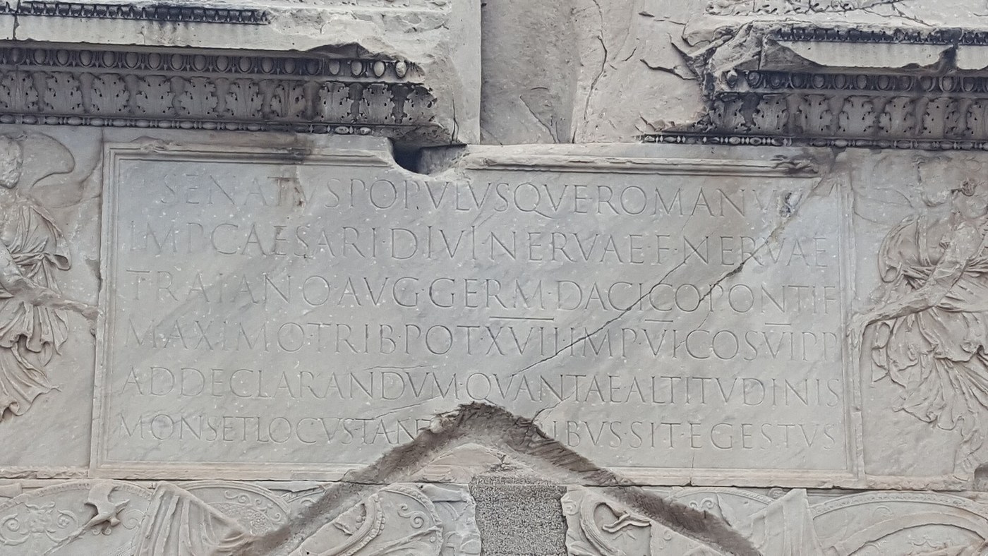


Roman V-Cut Lettering
The inscription at the base of Trajan's Column in Rome is widely regarded as the finest alphabetic lettering ever cut in stone. Every serif Roman typeface since — including the one on this page — descends from it.
The letters are cut to a V-section: two sloping faces meeting in a crisp central line at the bottom of the groove. There is no pigment needed to read them. The V catches sunlight on one face and throws the other into shadow, so the letter draws itself, and it redraws itself differently as the sun moves across the day.
The insight that unlocks the technique is that these are not carved shapes at all. They are painted shapes that were then cut. Edward Catich showed that the letters were laid out on the stone with a flat brush held at a constant angle — and that the serifs are simply what a brush does when a stroke starts and stops. Cut the brushstroke, and the Roman letter appears. Try to carve the shape directly and it never quite looks right.
ہدایات
Put on eye and lung protection
Put on eye and lung protection
Safety glasses and a dust mask before the first blow. Stone dust from limestone and marble is silica-bearing and is a genuine lung risk on repeated exposure.
درکار اوزار:
 شفاف حفاظتی عینک
 گرد کا ماسک
Bed a flat stone panel
Bed a flat stone panel
Set a flat limestone or marble panel on a sand bed at chest height, tilted about 15° toward you. Cutting on a vertical face fights gravity; cutting flat hides the light you need to judge the V.
اس مرحلے کے لیے مواد:
 تراشنے کے لیے سنگِ مرمر کا بلاک1 ٹکڑا
Rule the baseline and cap line
Rule the baseline and cap line
Rule a baseline and a cap line 60 mm apart. Roman capitals sit between exactly two lines — there are no descenders and no lowercase in this alphabet.
درکار اوزار:
 پیمانہ
Load a flat brush with paint
Load a flat brush with paint
Load a 12 mm flat brush with dark paint. From here the brush does the design work — you are not drawing an outline to fill, you are writing the letter.
اس مرحلے کے لیے مواد:
 مٹی کے رنگ روغن کے سفوف کا سیٹ1 سیٹ
درکار اوزار:
 چپٹا حروف نویسی کا قلم مو
Write the letters at a constant brush angle
Write the letters at a constant brush angle
Hold the brush at a constant angle of about 30° to the baseline and write the letters without rotating the wrist. The angle held constant is what makes verticals thick and diagonals thin — the stroke contrast is a by-product of the tool, not a decision.
درکار اوزار:
چپٹا حروف نویسی کا قلم موLet the serifs happen
Let the serifs happen
Finish each stroke with a short flick as the brush lifts, and let the serif form itself. Do not draw serifs as separate shapes. They are the entry and exit of the brush, which is exactly why they look inevitable on Trajan and fussy when drawn.
درکار اوزار:
چپٹا حروف نویسی کا قلم موLet the paint dry and judge the spacing
Let the paint dry and judge the spacing
Stand back and read it. Space letters by the area between them, not by equal gaps — an L next to an A needs less space than two adjacent verticals. Repaint any letter that reads wrong; paint is free, stone is not.
Cut the centre line of each stroke
Cut the centre line of each stroke
Run a shallow guide cut straight down the middle of each painted stroke with the flat chisel. This centre line is the bottom of the future V and fixes the letter's spine before any bulk is removed.
درکار اوزار:
 پتھر کی چپٹی چھینی
 پتھر تراشنے کا ہتھوڑا
Cut the first sloping face
Cut the first sloping face
Working from one painted edge, cut down at roughly 30° to the surface toward the centre line. Keep the angle identical along the whole stroke — a wandering angle gives a wavy shadow.
درکار اوزار:
پتھر کی چپٹی چھینیپتھر تراشنے کا ہتھوڑاCut the mirror face
Cut the mirror face
Cut the opposite face at the same angle so the two meet cleanly at the centre line. Depth should be roughly one third of the stroke width — a 12 mm stroke cuts about 4 mm deep.
درکار اوزار:
پتھر کی چپٹی چھینیپتھر تراشنے کا ہتھوڑاCut the serifs last
Cut the serifs last
Cut each serif as a shallow triangular flare running out of the stroke end, shallower than the main groove. Serifs cut to full depth look heavy and detached.
درکار اوزار:
پتھر کی چپٹی چھینیRead the letters in raking light
Read the letters in raking light
Take the panel into low side light and look along it. Every stroke should show one lit face and one shadowed face, with a continuous crisp centre line. Any flat or rounded spot in the V will read as a dead patch.
History & Context
History & Context
Catich's argument. Edward Catich — a sign painter before he was a priest and a scholar — proposed that the Trajan letters were written with a flat brush before they were cut, and demonstrated it by doing it. The evidence is in the letters themselves: the thick-thin modulation, the entry and exit shapes, and the way serifs join the stem are all natural consequences of a broad brush held at a fixed angle. The theory reframed the alphabet from a carved construction into a written one. It is widely accepted, though not entirely without dispute, and the fair way to state it is that Catich's brush-first model explains more of the letterforms than any alternative.
Dating. Trajan's Column was dedicated in AD 113, and the inscription on its pedestal is the piece in question. You will also see it dated "circa AD 100" in older typographic literature. If a source gives you a confident single year without saying which, treat it gently.
Why V and not U. A V-section has no flat bottom to collect water and no rounded floor to scatter light. Rain runs out of it, and it produces a hard-edged shadow that reads from a distance. It is also the shape a flat chisel naturally makes when cut from two sides. Form, tool and weather all agree, which is usually the sign of a solution that will last.
They were painted too. Roman monumental inscriptions were frequently filled with red pigment — minium — to make them read further. The bare stone letter we admire today is a weathered state, not the intended finish. The same is true of Roman and Greek sculpture generally: what survives is the substrate, not the surface.
Why this alphabet did not change. Roman capitals reached a form in the first and second centuries that has never been meaningfully improved for legibility at scale. Renaissance humanists copied these inscriptions directly, type designers copied the humanists, and the shapes went into metal type, then photocomposition, then digital fonts. When you set a document in a serif face today, you are using a two-thousand-year-old brush angle.
مواد
2- پلیس ہولڈر
- پلیس ہولڈر
یہ بلوپرنٹ بناتا ہے
CC0 پبلک ڈومین
یہ بلیو پرنٹ CC0 کے تحت جاری کیا گیا ہے۔ آپ اجازت لیے بغیر اس کام کو نقل، ترمیم، تقسیم اور کسی بھی مقصد کے لیے استعمال کرنے کے لیے آزاد ہیں۔
میکر کی حمایت کریں ان کے بلیو پرنٹ کے ذریعے پروڈکٹس خرید کر جہاں وہ میکر کمیشن وینڈرز کی طرف سے مقرر، کماتے ہیں، یا اس بلیو پرنٹ کی نئی تکرار بنائیں اور آمدنی شیئر کرنے کے لیے اسے اپنے بلیو پرنٹ میں کنکشن کے طور پر شامل کریں۔