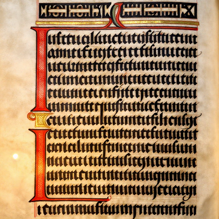


Gothic Blackletter Calligraphy — Textura Quadrata
Instructions
Draw Textura Guidelines
Draw Textura Guidelines
Textura Quadrata uses strict proportions based on the nib width. For a 2mm nib: the x-height is 5 nib-widths (10mm) — turn the nib sideways and stack 5 nib-width squares to measure this precisely. Ascenders and descenders are short in Textura — only 2-3 nib-widths above or below the x-height (not the generous extensions of italic). Draw your baseline, waist line (5 nib-widths up), ascender line (2-3 nib-widths above waist), and descender line (2-3 nib-widths below baseline). Keep the space between lines small, so that one line's descenders nearly meet the next line's ascenders — Textura is a dense, compressed hand. Some calligraphers also rule light vertical lines to keep the strokes upright; the white space between two strokes should be about one stroke width (see step 4).
Materials for this step:
 Calligraphy Practice Paper10 sheets
Tools needed:
 Graphite Pencil Set
 Protractor
Establish the 40-Degree Pen Angle
Establish the 40-Degree Pen Angle
Hold the broad-edge nib at approximately 40 degrees to the baseline — a slightly flatter angle than the 45 degrees many teachers use for italic makes the vertical strokes slightly thicker and the horizontal strokes thinner, contributing to Textura's dense, heavy appearance. The same angle is kept for every stroke, including the diamond serifs. Unlike italic calligraphy where letter shapes vary widely, Textura is dominated by repetition of near-identical vertical strokes — the discipline of maintaining an absolutely consistent pen angle is paramount. Practice making parallel vertical strokes: each one should be identical in width and angle to the last.
Materials for this step:
 India Ink30 ml
Tools needed:
 Calligraphy Pen Set
Master the Diamond Serif
Master the Diamond Serif
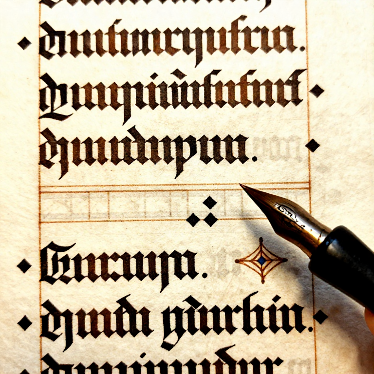
The diamond serif is the signature element of Textura Quadrata (the "quadrata" refers to these squared-off diamond endings). The diamond needs no change of pen angle: with the nib at your pen angle, a short stroke down and to the right, across the nib's own width, leaves a square standing on its point. To make an entry diamond: at the waist line make that short diagonal stroke, then pull straight down without lifting. For an exit diamond at the baseline: end the downstroke and finish with the same short stroke down and to the right, forming a matching diamond foot. In the most formal Textura, these diamonds are precisely defined — each one should be a clean, sharp-cornered diamond. Practice rows of single strokes with entry and exit diamonds until every diamond is consistent in size and shape.
Tools needed:
Calligraphy Pen SetBuild the Letters i, l, and the Minim Stroke
Build the Letters i, l, and the Minim Stroke
The minim is the fundamental building block of Textura — a single vertical stroke with diamond serifs at top and bottom, spanning from the waist line to the baseline. The letter i is one minim plus a diamond-shaped dot above (not a round dot — it is made by touching the nib to the paper at 40 degrees to leave a diamond mark). The letter l is a minim extended upward to the ascender line, with an entry diamond at the ascender height. In Textura, the space between minims within a word should equal the width of a minim stroke — this creates the even "picket fence" rhythm that defines the script. Write the word "minimum" (15 minims plus the i-dots and serifs) — if your spacing is correct, the minims should appear as a perfectly even row of identical strokes.
Tools needed:
Calligraphy Pen Set Paper Towel
Build the Letters n, m, h, u — Minim Combinations
Build the Letters n, m, h, u — Minim Combinations
The letter n is two minims connected at the top by a fine hairline or overlapping diamond serifs. In strict Textura, there is no curved arch between the minims (unlike italic n) — the connection is angular: the exit of the first minim meets the entry of the second at the waist line. The letter m is three connected minims. The letter h is an ascender stem with a second minim joined to it angularly at the waist line, as in n. The letter u is two minims connected at the bottom by an angular foot stroke. Notice how similar these all look — n, m, h, u are distinguished mainly by their height and position of the connecting strokes, not by fundamentally different shapes. This uniformity is deliberate: it creates the woven-texture appearance, though it also makes Textura notoriously difficult to read at speed.
Tools needed:
Calligraphy Pen SetBuild Angular Round Letters — o, c, e, d, b, p, q
Build Angular Round Letters — o, c, e, d, b, p, q
In Textura Quadrata, round letters are NOT round — they are constructed from angular strokes that only suggest roundness. The letter o is made from two curved strokes that meet at sharp points at the top and bottom, forming a hexagonal or angular oval. Each curve is essentially a slightly bowed minim. The letter c is the left half of the angular o, with a short stroke across the top. The letter e is a c whose top stroke is closed back to the stem, forming a small angular eye in the upper half. The letters d, b, p, q combine the angular bowl shape with ascender or descender minims. The angular treatment of curves is what makes Textura look so different from italic or Copperplate — there are virtually no true curves in the most formal versions. Each "round" letter maintains the same vertical rhythm as the minim-based letters.
Tools needed:
Calligraphy Pen SetBuild the Remaining Lowercase Alphabet
Build the Remaining Lowercase Alphabet
Complete the Textura lowercase: the Textura a is two-storey: a right-hand minim with a short angular head stroke at the top and a small closed angular bowl in the lower half. The letter f has a tall ascender stroke that curves slightly right at the top, with a crossbar at the waist line. The letter g has an angular bowl with a short descender and a closing stroke. The letters r and s are distinctive: Textura r has a small angular shoulder stroke (much smaller than italic r); the long s (ſ) was standard in medieval texts — a tall stroke resembling f but without the crossbar. The letter s at word-endings uses the round form we know today. The letters w, x, y, z are built from minim and diagonal strokes with the same diamond serifs. Complete the alphabet and practice each letter until the proportions and angles are consistent.
Tools needed:
Calligraphy Pen SetPractice Words and Text Blocks
Practice Words and Text Blocks
Write complete words and short sentences in Textura Quadrata. The inter-letter spacing should be exactly one minim-width throughout — this is critical for the woven-fence texture effect. If you squint at a well-written Textura text block, the black strokes and white spaces should form an even, rhythmic pattern with no holes or dark spots. Common practice texts include the opening of the Lord's Prayer in Latin ("Pater noster, qui es in caelis") or any passage from a medieval source. Textura fills its text block densely; the openness of the page comes from the margins around it. After writing a paragraph, step back and evaluate the overall texture before examining individual letters.
Materials for this step:
Calligraphy Practice Paper20 sheetsTools needed:
Calligraphy Pen SetLearn Textura Versals (Decorative Capitals)
Learn Textura Versals (Decorative Capitals)
The decorative capitals (versals) used with Textura are dramatically different from the lowercase: they are large, ornate, and often based on Lombardic or Uncial forms rather than the angular minim system. Versals are typically drawn with multiple strokes and sometimes filled in, rather than written in a single pen movement. A simple approach for practice: use Roman capital letterforms scaled to approximately 7-8 nib-widths tall, drawn with the same broad-edge nib. Add small diamond-shaped serifs and angular decorations. In medieval manuscripts, versals were often written in red ink (rubrication) or elaborately decorated with gold leaf and painted ornament (illumination). For practice purposes, write the capital in the same black ink but leave generous space around it — a Textura capital needs visual breathing room because the lowercase is so dense.
Tools needed:
Calligraphy Pen SetWrite a Finished Manuscript Page
Write a Finished Manuscript Page
Plan a complete practice page in the medieval manuscript style. Choose a text of 8-15 lines. Rule guidelines carefully in pencil. Write the text in Textura Quadrata with consistent spacing. Add a decorative versal capital at the beginning. If desired, leave space in the left margin for a simple decorative border. When the ink is completely dry — drying time depends on the ink and paper, so test a corner first — erase all pencil guidelines with a soft eraser. The finished piece should demonstrate the key qualities of Textura Quadrata: perfectly even vertical rhythm, consistent diamond serifs, angular round letters, dense text texture, and minimal inter-line spacing. This is the hand that defined the look of European books for centuries — the same visual DNA that Gutenberg replicated in metal type.
Tools needed:
Calligraphy Pen Set Container
Connected Blueprint Materials

Related Blueprints
These blueprints share knowledge with this one — techniques, materials, or principles that connect them in the learning graph.

CC0 Public Domain
This blueprint is released under CC0. You are free to copy, modify, distribute, and use this work for any purpose, without asking permission.
Support the Maker by purchasing products through their Blueprint where they earn a Maker Commission set by Vendors, or create a new iteration of this Blueprint and include it as a connection in your own Blueprint to share revenue.