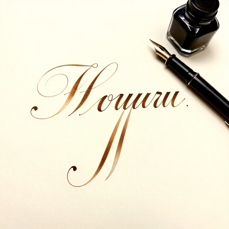
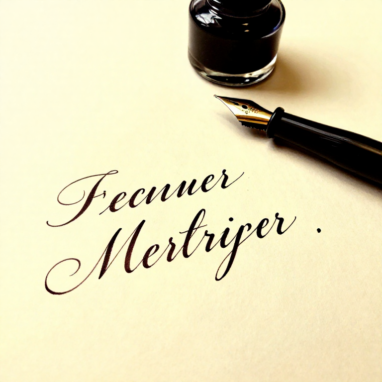
Copperplate Script with a Pointed Nib — Pressure-Based Calligraphy
دستورالعملها
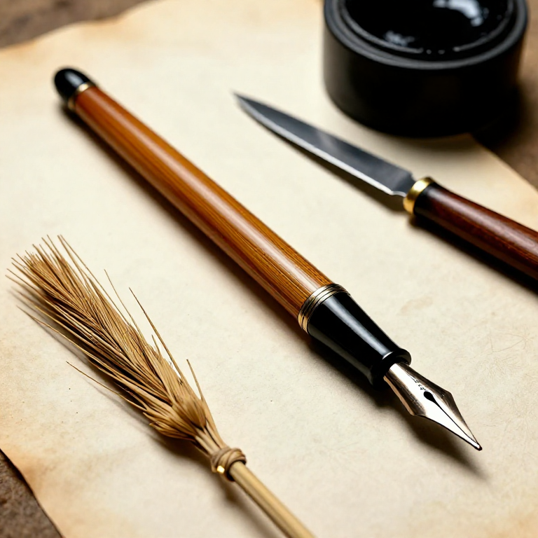
Set Up the Oblique Pen Holder
Set Up the Oblique Pen Holder
Insert the pointed nib into the oblique pen holder's flange. The flange positions the nib at an offset angle so that when you write, the nib tines align with the 55-degree slant lines naturally. Without an oblique holder, you would need to contort your wrist to achieve the correct slant. Adjust the flange so the nib tip sits centred on the slant line when the pen rests in your hand at a comfortable writing position. Prepare the new nib by removing its factory coating — pass it through a flame for 1-2 seconds or wipe with rubbing alcohol, then dry. This ensures ink adheres to the nib surface rather than beading off.
مواد مورد نیاز این مرحله:
 India Ink30 ml
ابزارهای مورد نیاز:
 Oblique Pen Holder
 Calligraphy Pen Set
 Paper Towel
 Container
Draw Copperplate Guidelines
Draw Copperplate Guidelines
Copperplate uses specific proportions. Draw guidelines with: x-height (body height of lowercase letters) of 4-5mm for practice; ascender zone equal to 1.5× the x-height above; descender zone equal to 1.5× the x-height below. Draw slant lines at 55 degrees from the baseline across the entire practice area — these are your letter angle guides. The 55-degree slant is measured from the horizontal baseline, not from vertical. All downstrokes follow this 55-degree angle. The distance between slant lines should be approximately half the x-height. You can print pre-made Copperplate guideline sheets to save time.
مواد مورد نیاز این مرحله:
 Calligraphy Practice Paper20 sheet
ابزارهای مورد نیاز:
 Graphite Pencil Set
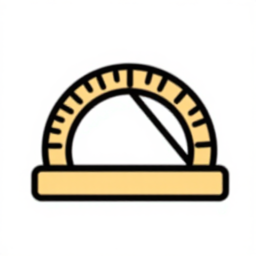 Protractor
Master the Fundamental Pressure Principle
Master the Fundamental Pressure Principle
The entire Copperplate system rests on one principle: upstrokes are hairlines (zero pressure — the nib tines stay closed, making the thinnest possible line), and downstrokes are shades (firm pressure — the tines splay apart, making a thick line). Load the nib with ink and practice: start at the baseline, push gently upward along the 55-degree slant with almost no pressure (hairline), then at the top, transition smoothly into a downstroke with gradually increasing pressure (shade). The transition from thin to thick and back must be smooth — no sudden jumps. This pressure-release cycle is the heartbeat of Copperplate. Practice columns of alternating upstroke-downstroke ovals until the transition is effortless.

ابزارهای مورد نیاز:
Oblique Pen HolderPractice the Eight Fundamental Strokes
Practice the Eight Fundamental Strokes
All Copperplate lowercase letters are constructed from eight basic strokes: (1) the underturn — a thick downstroke transitioning into a thin upstroke curve at the baseline; (2) the overturn — a thin upstroke curving over at the x-height line into a thick downstroke; (3) the compound curve — an overturn connected to an underturn (an S-shape with thick-thin-thick transitions); (4) the oval — a complete thin-thick-thin ellipse at the 55-degree slant; (5) the ascending loop — a thin upstroke rising above the x-height and looping back into a thick downstroke; (6) the descending loop — a thick downstroke extending below the baseline and looping back in a thin upstroke; (7) the dot; (8) the cross-stroke (horizontal hairline). Master each stroke individually before combining them into letters.
ابزارهای مورد نیاز:
Oblique Pen HolderBuild the Letters i, u, n, m — Underturn and Overturn Family
Build the Letters i, u, n, m — Underturn and Overturn Family
The letter i is a single underturn (thick downstroke curving into thin upstroke at the baseline) plus a dot. The letter u is two underturns connected. The letter n is an overturn (thin-to-thick) connected to an underturn. The letter m is three connected overturns and underturns: overturn-underturn-overturn-underturn. These four letters establish the fundamental rhythm of Copperplate. The spacing between strokes within each letter must be perfectly even — the negative space (white area) between vertical strokes should be identical throughout. Practice each letter in rows, then alternating: i-u-n-m-i-u-n-m. The consistency of your thick downstrokes (width and slant) determines the quality of the entire script.
ابزارهای مورد نیاز:
Oblique Pen HolderBuild Oval-Based Letters — a, c, d, e, g, o, q
Build Oval-Based Letters — a, c, d, e, g, o, q
The letter o is the fundamental oval, constructed in one continuous stroke: begin at approximately 1 o'clock on the oval with a thin upstroke, curve left and down into a thick downstroke on the left side, curve around the bottom as a thin stroke, rise up the right side as a thick downstroke, and reconnect at the starting point with a thin transition. The oval is tilted at 55 degrees matching the script slant. The letter a adds an underturn to the right of the oval. The letter d adds an ascending loop above the oval. The letter c is an incomplete oval (open on the right). The letter e adds a small loop inside the c. Consistent ovals are the hallmark of skilled Copperplate — practice the basic oval until its shape and pressure transitions are automatic.
ابزارهای مورد نیاز:
Oblique Pen HolderBuild Ascending and Descending Loop Letters
Build Ascending and Descending Loop Letters
Ascending loop letters (b, d, f, h, k, l) begin with a thin upstroke that rises above the x-height, curves left into a loop, and descends as a thick downstroke through the x-height zone. The loop should be narrow and elegant — approximately one-third the width of the x-height. Descending loop letters (f, g, j, p, q, y, z) have a thick downstroke that extends below the baseline, curves right into a thin upstroke loop that crosses the downstroke at the baseline. The letter f is unique because it has both an ascending and descending loop. These loops must be smooth and consistent in size across all letters — uneven loops make the writing look amateur.
ابزارهای مورد نیاز:
Oblique Pen HolderComplete the Lowercase Alphabet and Practice Words
Complete the Lowercase Alphabet and Practice Words
Build the remaining lowercase letters using combinations of the eight fundamental strokes: r uses a modified overturn with a small shoulder; s is a compound curve with modified entry; t is a short ascending stroke (not to full ascender height) with a cross-stroke; v and w use angular connections; x uses crossing diagonal strokes. Practice the complete alphabet in order, then write words that test different letter combinations. Write the word 'minimum' to check stroke consistency (it contains only underturn and overturn strokes). Write 'copperplate' to test diverse letter combinations. Write 'flourishing' to practice ascending and descending loops together. Focus on maintaining consistent slant, even spacing, and smooth pressure transitions throughout each word.
مواد مورد نیاز این مرحله:
Calligraphy Practice Paper20 sheetابزارهای مورد نیاز:
Oblique Pen HolderLearn Copperplate Capitals
Learn Copperplate Capitals
Copperplate capitals are significantly more complex than the lowercase letters — they are ornate, flowing forms that occupy the full ascender-to-descender space. Capitals are constructed from compound curves, ovals, and sweeping entrance strokes. Begin with the simpler capitals: I, J, L, which are based on single compound curves. Progress to the oval-based capitals: C, E, G, O, which build on the fundamental oval expanded to capital height. The most complex capitals (D, M, N, W) combine multiple compound curves and require precise control. Capital letters are typically 2-3× the x-height. Each capital begins with a dramatic entrance stroke — a long, thin approach curve that establishes the letter's rhythm before the first thick downstroke. Practice one capital at a time, writing it at least 20 times before moving to the next.
ابزارهای مورد نیاز:
Oblique Pen HolderAdd Simple Flourishes
Add Simple Flourishes
Flourishes are decorative extensions of the letterforms — elongated hairline curves added to the beginnings and endings of letters. In Copperplate, flourishes should follow the same 55-degree slant system and use the same pressure principles (thin on upward/sideways movements, thick only on controlled downstrokes). Start with simple extensions: lengthen the descender loop of y or g into a sweeping curve; extend the entry stroke of a capital into a gentle spiral. The key rule of flourishing: every flourish must be a single, confident arm movement. Hesitation creates wobbles. Practice the motion in the air above the paper before committing to ink. Restraint is essential — over-flourished text is harder to read and looks chaotic. One or two flourishes per line of text is usually the maximum for elegance.
ابزارهای مورد نیاز:
Oblique Pen Holderمواد نقشههای متصل
نقشههای مرتبط
این نقشهها دانش مشترکی دارند — تکنیکها، مواد یا اصول
Related blueprints
Other builds that share materials, tools, or techniques with this one.

CC0 مالکیت عمومی
این نقشه تحت مجوز CC0 منتشر شده است. شما آزاد هستید آن را کپی، ویرایش، توزیع و برای هر هدفی بدون نیاز به اجازه استفاده کنید.
با خرید محصولات از طریق نقشه از سازنده حمایت کنید و او کمیسیون سازنده تعیین شده توسط فروشندگان، دریافت میکند یا یک نسخه جدید از این نقشه ایجاد کنید و آن را به عنوان اتصال در نقشه خود قرار دهید تا درآمد به اشتراک گذاشته شود.